Tuesday, February 3, 2009

Brooklyn

This is our new home! It has great modern lines, really stark and clean looking. Mostly painted white.

There is wood cladding on the exterior and on the decks. Lots of glass and metal in the house.

Lots and lots of windows and sliding doors to keep it very airy and light.

It’s a compact design but there is no lack of space.


01
This is the front of the house. There are sliding doors from the lounge leading to a wooden deck.
02
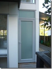
This is the front door which is to the right of the sliding doors in the previous pic.
             05   
Still the front doors but seen from the corner. On the first floor is a fantastic glass corner that lets in piles of light.    
04
The glass corner on the right and the extending bedroom coming out on the first floor. This room will become my art room with a space bed (for visitors – so you have to come visit right!!!)
03
This is the right had side of the house, a little driveway with undercover parking. Getting a house with parking off the street is a really big deal. This is fabulous. At the back you can see a little storage room (I’m convinced it’s a garage for my new bike tho).
06
This is the lounge in it’s empty state. It is very spacious. Warm carpet in the lounge and dining area.
08
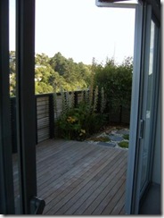
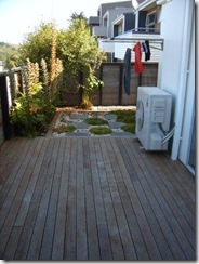
This is the back deck.
17
The smart ground work below the washline.
16
Deck and washline.
07
The kitchen in an empty state. The tile floors are ceramic but look a bit like cork. Same tiles are in the bathrooms upstairs.
14
This is a view from the lounge into the kitchen, the (currently empty except for a drier which does not belong there) dining room and then onto the back deck.
15
Looking the other way – from the kitchen into the lounge.
11
This a long horizontal window that runs along the first floor along the staircase. The reflection of light on the white walls is great.
10
The empty art room – the back wall colour is a warm grey (Warm Grey #4 if you know Copic Markers!). The rest of the walls are white.
18
The middle room has been set up as the study. Still in a bit of a state here. See the really cool printer on the left?!? It rocks.
13
The lounge. We are hiring the furniture and electronics  in the lounge. It’s pretty cost effective.
12
And the lounge again slightly different angle. Windows everywhere!
19
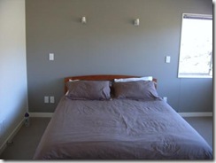
The bed in the bedroom. This is a king size bed and there is still plenty of space. Ryan had to hunt high and low to find a place with reasonably sized rooms and rooms with some cupboards in them.
20
The view from the bedroom. Spectacular!
21  
09
The bathroom with the bath in it.
22
This is the en-suite bathroom with the shower. The tiles in the shower are horizontally layed rectangle tiles, they are a beige-grey colour and quite shiny. Works well in the sleek bathroom.
23
For my SA design friends – notice the plug switches IN THE BATHROOM and in the reflection in the mirror you can see the light switches and the under floor heating panel. Odd stuff right?

No comments:

Post a Comment